Color is so personal.
We all gravitate toward certain colors and color combinations. Our choices express our personalities and creativity. Favorite colors make us feel good.
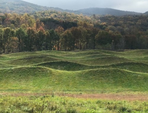
I love gold foliage in the garden. It makes dynamic combinations with other colors and looks like sunshine.
One of my clients thinks gold plants look diseased.
Don’t let anybody make you feel bad about the colors in your garden. Differences are what make the world go ’round.
But do be open to new possibilities, just to keep things interesting. Gardens change, and gardeners do too.
Colors that work together
Many years ago I wrote and photographed a story about how a Navajo weaver weaves a rug. The magazine wanted me to get her to talk about color theory.
Martha Yazzie, clearly a gifted colorist, had no clue what I was getting at.
Finally she said, “I just like colors that match.”
We see those “colors that match” in the world around us. Why not take them home to our own gardens and play with them?
Play is the operative word. You don’t need to agonize over a color wheel or follow a formula to create satisfying garden color.
Paying attention to colors in food and in paintings, in fabrics and autumn leaves and shimmering sunsets on water inspires me to play with color in the garden.
As a young gardener – and trained painter – I wanted to run the other way when horticultural experts expounded on color.
Their proclamations seemed like nose-in-the-air opinions to me. People nodded and took notes – and thought they were doing something wrong.
After hearing one garden expert say, “I’d never have an orange flower in my garden,” I went home and planted an orange and purple garden.
I love that combination still.
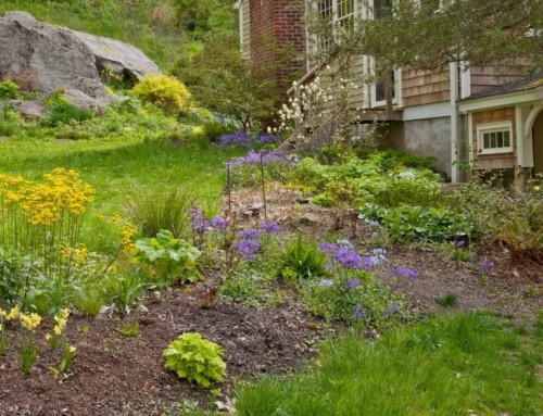
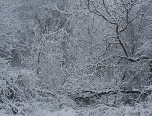
Those warmly golden glowing willows that I view against murky purple-blue mountains on my way into town? They make me think, hmm, how can I use this?
Greenish-yellow Patrinia scabiosifolia flowers glow against dull, dark purple smokebush foliage.
Or how about surrounding a container of that almost iridescent black and purple foliage plant, Persian shield (Strobilanthes dyerianus), with gold hostas?
Oops – deer would eat hostas in my yard. Maybe golden feverfew, or grasslike Acorus gramineus ‘Ogon’. Or I could nestle a pale yellow tuberous begonia amongst purple leaves.
Now that I think about it, these are just more nuanced versions of that irresistible clear-toned autumn duo, purple asters and yellow goldenrods.
Some people find red and orange difficult hues to use in the garden, but I welcome those hues.
My problem has been with sweet pink. It’s been a tyrant and an insipid bore in my garden, but others use it well.
In fact, I’ve used it well too, in the garden of a client who can’t get enough pink.
I once heard a garden expert pass judgment in a garden, saying “Doesn’t she know pink and orange don’t go together?” I really didn’t see why not.
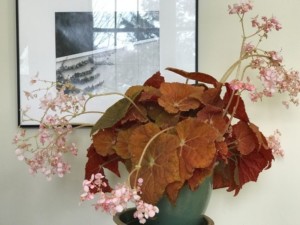 My new ‘Autumn Embers’ begonia, with rusty orange leaves and sprays of sweet pink flowers, planted in a jade ceramic pot, makes me shiver with delight every time it catches my eye.
To my eye, there’s hardly any color that chartreuse doesn’t improve by proximity.
Amaryllis ‘Rosalie’, a vibrant cooked shrimp-toned pink with a chartreuse center has given me much pleasure for weeks now.
I’m seeing pink with new eyes.
It’s not the color, it’s how you use it
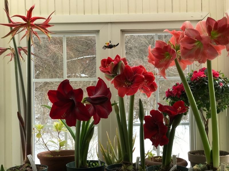
Many a pontificating expert has warned that reds with a blue cast and warm reds swear at each other and should never, ever, ever be put near each other.
The amaryllis on my windowsills and clustered in the greenhouse window over my kitchen sink (top photo) – ‘La Paz’, ‘Magnum’, ‘Magical Touch’, ‘Red Pearl’ and the delightful ‘Rosalie’, ‘Cherry Nymph’, ‘Monte Carlo’ – put that canard to rest.
Reds of every description – from bloody beef and claret to shrimp, coral, rust, maroon, cinnabar, cherry, scarlet, orange-ish and magenta – are glorious feast.
I’m starved for color no more – at least indoors.
The nuance created by varying one underlying hue makes it work.
Turn up the heat or tune it down, go lighter or darker, mix with other tones or be as pure as pure can be.
The more variations on a theme, the more they blend into something complex and resonant.
White and olive green brushwork, glowing chartreuse throats and the ping of clear yellow pollen-covered anthers are the icing on the cake.
I just might translate that harmonious blend of assertive hues to outdoor gardens this summer. I’d certainly add purple to the mix
And maybe sweet pink wouldn’t be such a tyrant with this power-packed crowd.