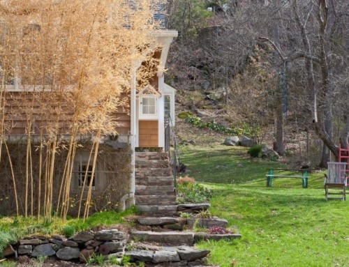
My “there are no rules” attitude and “keep throwing color at it until it sings” way of gardening doesn’t work for everyone, especially beginners afraid of making mistakes.
There are no mistakes. That’s how you learn.
But it does help to have some guidance.
Although Stephanie Cohen and Nancy Ondra’s Perennial Gardener’s Design Primer was published way back in 2005, it remains, as the cover states “The Essential Guide to Creating Simply Sensational Gardens.”
I spoke with Stephanie Cohen, a long-time teacher, recently.
She is not short of opinions. But the book isn’t a bunch of rules, it’s how to think about color and design.
She’s quick to say, “Somebody will tell you “you can’t do that.” But if you like it, go ahead.”
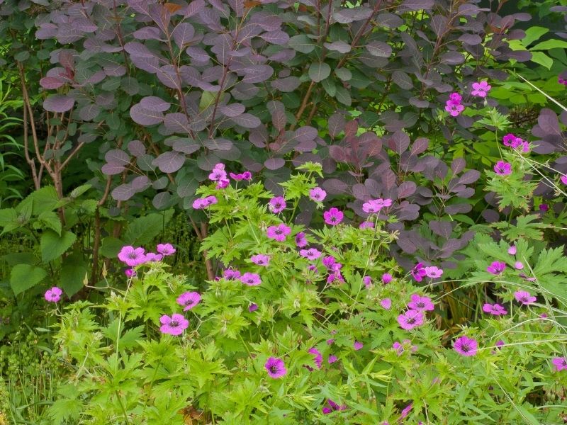
I’ve heard garden experts tell people that magenta is vulgar.
She likes magenta and is fond of “weird magenta geraniums with black centers.”
“What are you going to put with that?” she asks, “certainly not red – although somebody might.” (Somebody like me just might).
“When people start gardening, they tend to be timid about color. They start out with pastels and neutrals (green foliage, grasses and ferns).”
“They’re afraid of color. As they progress, they start to think things out and their color choices get bolder.”
She notes that the size of the garden matters when it comes to bright colors.
Too many bold colors in a small garden makes for what she calls a “sunglasses garden” – you need dark lenses to tone it down. “In a large garden, with neutrals in between, you can have multiple small vignettes of bold color.”
Color, movement, harmony – and contrast
“I don’t like to see a big blob of yellow in one spot. If you use yellow in front, middle and back, the repetition moves your eye around the garden, you take in the whole thing. Plants don’t have to look alike, it’s the color that repeats.”
The book is full of liberating concepts and good advice – along with plant suggestions.
Narrowing your palette to a few main colors gives your design a well-thought-out appearance…The color theme you choose can be the same from spring through fall or change with the season.
The more similar the colors you choose, the more harmonious the planting will appear.
Adding some contrast can give your planting a bit of edginess and save it from being predictable.
You probably won’t want to base a garden on equal amounts of two opposing colors… choose one or two main colors and use smaller amounts of contrast as accents.
Not sure what you want? Take color cues from existing features in your yard or in your home – the front door, the trim around your windows, and your boundary fence, for example.
Be cautious of seeds that come in mixed colors; planting too many of these can create a muddy, jumbled effect.
Personal preferences
The book greatly benefits from the authors’ two voices.
Stephanie tends to build her combinations around harmonious colors and contrasting forms.
Nan is a self-confessed sucker for colorful foliage, so most of her best-loved combinations feature dramatic contrasts of leaf colors and textures.
It’s best to see plants in bloom for yourself before you choose them – or be prepared to move them of they’re not what you expected.
If you think your red flowers are swearing at each other: separate different red flowers with other hot colors, or with lots of green foliage so you won’t take in both reds at the same glance.
White flower themed gardens are crisp, especially visible at dusk. But they’re not all the same. Pure white, cream, white tinged with yellow, green, blue or pink can look muddy together.
The authors suggest that you separate (white-flowering) plants with green, blue, gray, or silvery foliage to make the variations less noticeable.
They go on to remind readers that lovely, as they are, white flowers do not die beautifully, so unless you’re willing to constantly deadhead flowers, situate a white garden at a distance.
And if you’re worried about your white garden looking a bit dull, go ahead and add a few splashes of maroon, yellow, blue, or another color to liven things up – the whites will look all the better for the contrast.
“If you want your garden to be more interesting,” Stephanie said when we spoke, “it’s not more work – it’s more thought.”
Perennial Gardener’s Design Primer helps you think it through.